Sound UI design that promotes awareness and simplifies consideration is the first step towards maximizing IAP revenue.
Despite the growing prominence of ad monetization, in-app purchases (IAP) remain a tentpole of modern mobile game monetization.
For most mobile games, conversion rates hover around 1-2%, though some recent (and encouraging) studies have put that number as high as 13%. Regardless of their benchmark, increasing IAP conversions should be the priority for all mobile game publishers, but it’s easier said than done. Machine-learning based solutions like wappier’s Global Pricing Optimization solution offer innovative opportunities to maximize revenue at the pricing level, yet there is one important step within the developers’ control that can affect immediate positive change: optimize IAP UI design.
According to Forbes research, there’s precedent for a well-designed user interface update increasing conversion by as much as 200%. So how does it work? IAP UI design optimization is related to two key user experience metrics: awareness and consideration.
In-app purchase UI design for awareness
Before anything else, ask yourself: “Are my IAPs easy to find?”
More specifically, “what percentage of users are even reaching my IAP store?” The answers lie in the sales funnel. Marketers familiar with the concept can attest that the number of users who complete a purchase can only ever be a percentage of those who are first made aware of the option and are then given the opportunity and necessary resources to consider or evaluate the purchase.
If users are struggling to find your storefront, that’s an unfortunate sign that your UI isn’t optimized for the first stage of the funnel: awareness. Thankfully, there are a few quick and easy IAP UI optimizations that can help:
Adopt common visual language and iconography. Take note of how the most popular games or apps in your category present their IAP storefronts. If they’re using particular icons, button styles, or color patterns to illustrate a path to conversion, it’s in your best interest to do the same.
Distinguish your IAP store from its surroundings. Create contrast between a storefront button and the rest of the interface with added emphasis to color and brightness that attracts attention and draws players in.
Minimize the steps required to reach the store. Each additional step increases the players chance to abandon the task altogether. Optimize for minimal friction wherever possible: one click to open the IAP storefront and another to make a purchase.

In-app purchase UI design for consideration
Once you’ve guided users to your in-app storefront, the next stage of the funnel comes into play: consideration. IAPs should appear with enough contextual information that they can be easily evaluated for their potential value. Specifically sales or bundles should use UI elements to articulate the specifics.
- Communicate discounts with badges. On a mobile screen with limited space, badges are a great way to show the value of a deal. Use banners or pop outs that highlight “Best Value” or “50% Off” directly on or near relevant IAPs so that players can intuitively evaluate the best deal for their money without having to actually run the calculations.
- Promote bundles with full-screen interstitials. Full-screen interstitial pop ups can effectively illustrate the contextual and/or gameplay value of bundles. When timed properly, these interstitials can boost awareness as well!
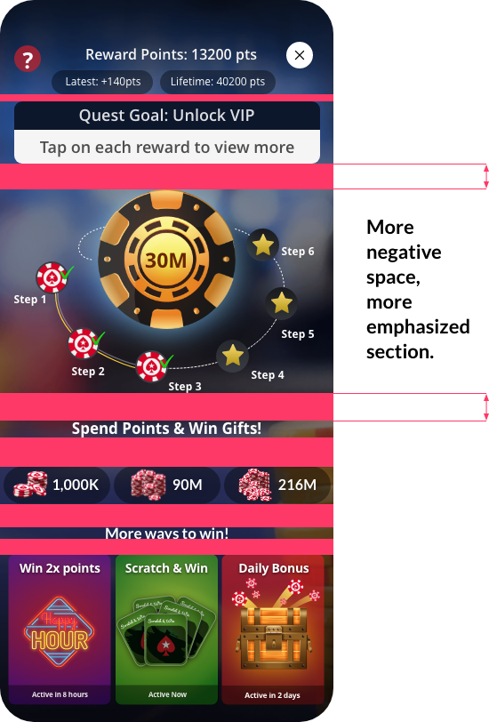
- Leverage white space. UI white space allows designers to use contrast and proximity that emphasises the most important elements of a storefront. IAPs that drive the bulk of your revenue should have extra breathing room. The added space lends weight and gravity to the element.

As much of mobile game monetization is data-driven, design innovations are often overlooked, especially when considered against major feature updates. However, if history is any indication, ensuring that your IAP UI design is smooth, intuitive, and instructive will increase conversions and overall revenue. Before pricing can be optimized, awareness and consideration should be streamlined. Simple changes like leveraging white space or putting badges on a high-value deal can immediately enhance performance and provide the ideal framework for more sophisticated solutions.


